AdSense Responsive Ads - Why Not?
Google telah secara konstan menambahkan fitur-fitur baru ke AdSense, menawarkan penerbit lebih banyak kontrol atas bagaimana iklan ditampilkan di situs web mereka. Berikut adalah beberapa fitur yang terkait dengan penerapan kode iklan yang diluncurkan selama 12 bulan terakhir:
- Introduction of Asynchronous Ads — July 2013
- Introduction of Responsive Ads — July 2013
- Introduction of Custom-Sized Ads — December 2013
At this moment, publishers can choose from standard, responsive and custom-sized ad units when creating one. If you have not chosen the ad code implementation method or you are looking forward to change it, I suggest going for responsive ads.
The Problem With Standard and Custom-Sized Ads
Both standard and custom-sized ads are fixed size which means they do not adapt to fluid or responsive website layout. Web designers understand that fixed size ads influence the layout of a website; and likewise, the website layout dictates the ad sizes to display. For example, consider a two column layout that must fit within 960px or wider. In order to put the ads and layout together you can:
- Write down all possible combinations of ads that fit within 960px (for example 468x60 + 300x250, 468x60 + 336x280, 728x90 + 200x200), choose a combination and size the columns accordingly
- Size the columns aesthetically (for example 640px content, 280px sidebar) and choose the largest ads that fit (468x60 + 250x250)
As evident from the above example, there are some disadvantages of using fixed size ads:
- They only work with fixed layout or fluid layout with minimum widths
- Fixed size ads tend to waste horizontal space, for example when a 250x250 ad unit is displayed inside 280px sidebar
- Fixed size ads can be counterproductive: if you (or your boss) decides to change the website layout then you will have to generate new ad units from the AdSense interface; you cannot change the width and height of fixed size ad units through JavaScript or CSS
There is a workaround though: you can build an array of ad units of different sizes and use JavaScript to determine and display the largest ad that fits (ad code modifications that are "harmless to advertisers" are permitted). However, we now have a much better option: Responsive Ads.
Advantages of Responsive Ads
Responsive ad units allow you to control the size of ads on your page across various devices and screens using CSS and media queries. Despite their name, they work with fixed, fluid and responsive layouts. Plus there are additional reasons why I vouch for responsive ads:
- Automatic sizing based on available width: by default, responsive ads occupy all available width and display the best standard ad size that can go with that width
- Automatic sizing after screen orientation change: responsive ads dynamically change their size/load a new ad if its dimensions change after screen orientation change (when a phone or tablet goes from portrait to landscape and vice-versa)
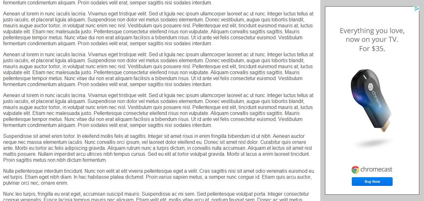
Since responsive ads are sized automatically, it is no longer necessary to generate various ad units of different sizes for different website layouts and screen sizes. Responsive ads automatically deliver small ads on small screens and large ads (such as 970x250 and 300x1050) on large screens. As a matter of fact, I used just three responsive ad units (to track header, sidebar and footer ads separately) in a project that spans 200+ websites and 10+ different layouts. Responsive ads have not let me down so far. Set them, forget them, concentrate more on your website design. The following screenshots demonstrate how responsive ads in a fluid width page appear on different screens. Click on image to view original size for better comparison.
Responsive Ad on 1366px wide desktop screen

Responsive Ad on 1000px wide tablet screen
Disadvantages of Responsive Ads
For the sake of completeness I am listing down the issues with responsive ads:
- Synchronous ad code is not available for responsive ads: not much of a disadvantage unless you focus on your ads instead of content
- The parent container needs a defined width: the width of responsive ad depends on that of its parent, not the other way round
- Responsive ads will cause a reflow: the height of the responsive ad is zero until the
adsbygoogle.jsscript does its magic, which could happen after some part of the page has rendered. In this scenario, the responsive ad will appear all of a sudden, pushing down the content below it causing a reflow. This can be annoying.
References
- AdSense Blog — stay up-to-date on AdSense tips and news
- AdSense Help: Ad code implementation — all you need to know about creating and implementing ad units

Komentar
Posting Komentar